Flight Patterns
March 2, 2015
April 2014 through April 2015
“Flight Patterns”
Hartsfield-Jackson-Atlanta
Internationaal Airport, T-North Concourse, opposite Gate T12

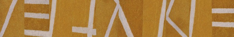
“Clark’s Fork”
53.5″ h x 33″ w
wool, cotton backing, acid dyes
tufting with pneumatic punch gun; sheared loops; hand-dyed
A video about the artists in the show is available for viewing at http://davismoye.com/flight-patterns-exhibition-now-open-at-hartsfield-jackson-atlanta-international-airport/
Now showing at the New Mexico Museum of Art in Santa Fe
November 15, 2014
“HUNTING AND GATHERING: NEW ADDITIONS TO THE MUSEUM COLLECTION”
November 7, 2014 – March 29, 2015

“Arroyo Seco #2”
2002
75.5″ x 51″
wool pile, cotton backing, acid dyes
tufting with pneumatic punch gun; sheared loops; hand-dyed
Gift of the artist in memory of Arlene LewAlllen
“Art from the Heartland 2014”
April 17, 2014
ART FROM THE HEARTLAND 2014″
April 11 – June 8, 2014
Indianapolis Art Center
Indianapolis, IN
This biennial regional exhibition is open to artists residing in Indiana, Illinois, Wisconsin, Michigan, Ohio, and Kentucky. Last year was the first time I entered the show with sculpture, a recent and radical departure from my earlier 2 D work in tufted wool and pieced cotton organdy. My first submission to juried shows at the Indianapolis Art Center was in 1987, a competition juried by Holliday T. Day, then the Director of the Indianapolis Museum of Art. I was awarded Best of Show award for “Cool Jazz.” In the 2012 Art of the Heartland biennial, I came away with the Best in 3 D award for two of my rubber sculptures. This year I was awarded Honorable Mention in 3D for my “Black Vessel #1” sculpture. The juror was Sarah Green former Curator of Contemporary Art for the Indianapolis Museum of Art.

“Black Vessel #1″ 12.5″h x 21″ l x 16″ w rubber; waxed 4-ply linen cord folded, hand-stitched” running stitch
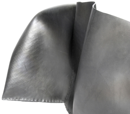
“Black Vessel #1”, detail

“Black Vessel#1”

“Black Vessel#1”
Now showing at the Mint Museum in Charlotte NC…
September 20, 2013

“Arroyo Seco #1”
(2002)
78″ x 53″
wool, acid dyes, cotton backing
tufting with industrial punch gun; sheared pile with sheep shears; hand-dyed
Currently on display at the Mint Museum UPTOWN as part of its permanent collection.
The white lines on the horizontal yellow bands were inspired by split-rail fencing along our dirt driveway in our New Mexico home. They represent the shadows cast by the fence rails on the driveway. The background bands make further reference to the fences.
I submitted 2 recent sculptures to the 2012 “Art from the Heartland” show at the Indianapolis Art Center. It is a biennial exhibition showcasing the work of artists from Indiana, Ohio, Illinois, Kentucky, Michigan, and Wisconsin.
This year the show was curated by Paula Katz, Director and Curator of the Herron Galleries at the Herron School of Art and Design in Indianapolis. She awarded Best of Show, Best of 3D, Best of 2D, and 5 honorable mentions. I won the Best of 3D award for “Black and Blue #2” and “Black and Blue #3.”
Since 2011, I’ve been making 3D constructions of natural rubber–a radical departure from three decades of 2D fiber artwork–using fiber processes such as piecing and hand-stitching. I bind together my sculptures using a basic textile technique: a hand-sewn straight stitch. The form of my rubber constructions develops from the process.
This work is surprisingly organic and soft compared to the hard-edged aesthetic of earlier work. I’m excited about the new direction my work is taking and curious as to where it will lead.
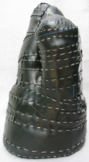
“Black and Blue #2”
2011
22″ x 13″ x 10″
rubber/ waxed linen cord
hand-stitching
private collection
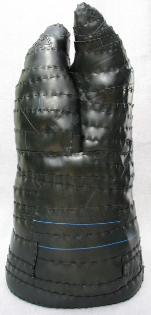
“Black and Blue #3”
2011
24″ x 13″ x 11″
rubber/ waxed linen cord
hand-stitching
Searching for form in 2-D
February 26, 2012
I sweated my first tufted piece as a graduate student. I wasn’t sure whether I was to work on it independently or after having a conference with Budd Stalnaker about it. Too shy/terrified to talk with him about what I had in mind for it, I proceeded on my own in my home studio.
I retrieved my folder on the piece to find out what I was thinking in the spring of 1983, my first year of graduate studies in the “Woven and Constructed” class at IU. The first page is a row of 16 yarn samples, each tied into a punched hole with the dye formula beside it.

Yarn samples for "For the Fifth Wall"
Next is the dye- stained worksheet of one of the dye sessions that yielded some of the colors I used.

Dye worksheet
Only 4 pots!–a short dyeing session. Two with 300 gms of wool per pot–one to get lilac yarn; the second an over-dye effort undoubtedly to rid myself of what must have been a pink I’d previously dyed but couldn’t see myself using. I added violet blex and red dye solutions to the pot w/ pink yarn. Two pots with 200 gms of wool per pot, each pot with dye for the same blue. I was up to my usual loosey-goosey MO for I see that I made a notation that I’d added some Black B to one of the blue pots….like a cook adding more seasoning to tweak the flavor.
On a second dye worksheet, it appears that I’ve pared down the # of colors to 8 from the original 16.

Figuring out amount of yarn and colors needed
A simplified sketch of the rug-to-be tells me that I’d decided on its basic composition. Next to it I’ve written” Love it!” 29 years later, I wish I’d stuck with what I see in this sketch. I’ve divided its area into 3 sections along its long side. One area contains a penciled spiral shape–along one section I’ve written 5′ and further divided that into 3′ and 2′. It appears that I’m figuring out the square footage of that area and its colors to determine how much yarn and what colors I will need to dye.
Next is an empty area with “burgundy = 3′ x 6′ ,” and “8# + 1# above [i.e. for the spiral] = 9#” penned in. I’m puzzled by the # sign because in the dye lab we used the metric system, not pounds (#). A note with an arrow pointing to the 9# of burgundy says “could mix irregularly with violet or black. No–for this one do a plain field.” Ink smears and crossed-out writing cover the page indicating impulsive decision-making–typical. At the bottom I instruct myself to “keep track of how much is used so’s know for next rug dye.”
Beneath the sketch I’ve taped down 7 pieces of different colored yarn with the number of pounds (#) of wool I calculate I’ll need of each: 9# of burgundy + 1# – 2# of the 7 colors. “21#” is circled with the notation “too much?” next to it. I’ve penciled in “yes” next to 21#. Why the # symbol? I suspect it has to do with the weight of the industrial size skeins of wool yarn that we bought from John Wilde Yarns of Philadelphia. We purchased them in bulk by the #. One skein weighed approximately 3#. For dyeing purposes, we wound skeins of yarn weighing 100 grams. For testing of dye formulas, we wound and weighed small skeins of 10 gms and scaled down the dye formula.
A final dyeing-related page shows entries of all the color and amounts of wool I needed. Looks like a summing up after the fact. At the top I read “Off the Wall,” my working title for the rug.

Colors/Yarn used
Which brings up the issue. Why a rug? Why not a piece for the wall? I think my home background had something to do with this. I probably never even considered making a wall piece….almost too much of a challenge because it’s more like “art” and what did I know about art? A rug is accessible and familiar–I could pull that off. Maybe I sensed less expectations, less exposure to criticism. After all, it was “just a rug.”
Rugs, carpets had been big in the home I was brought up in. My mother collected oriental rugs, an interest most likely fed by our living in the Middle East for many years–in Egypt and Pakistan. I recall rug merchants coming to the house with their bundled-up wares…spreading them out on the living room floor as my mother and the merchant sat on the floor around them, choosing and haggling over cups of chai. My mother preferred Persian rugs with their less angular, more organic, viney, fruit and floral designs and deep, lush colors and pile. I recall one merchant in particular bad-mouthed Turkish rugs as inferior products on a knots-per-inch basis and cruder feel or hand. Even then I recall favoring the more geometric look of the Caucasian rugs and of the Turkish rugs.
An example of a Persian rug that would have appealed to my mother.

Feraghan, late XIXth c, "The Oriental Rug Collection of Jerome and Mary Jane Straka," © 1978, The Textile Museum, Washington D.C.
While I can fully appreciate its beauty, my own preference leans more toward the more austere and stark as in the example of a Caucasian rug below. These are shown here as perhaps extreme examples of two differing sensibilities.

Kazak prayer rug, Caucasus, late XIXth/ early XXth c,"Oriental Rugs of the Hajji Babas," Daniel S. Walker, plate 11, ©The Asia Society 1982, Harry Abrams, NY
Also as to “why a rug?” Budd had purchased 9 tufting punch needles as a new tool to experiment with in class. They were made by Rumplestiltskin’s in a light blue plastic casing. They look like a hand-held mixer with a large needle where the beaters go. I will post a separate entry on these punch needles.
In my “For the Fifth Wall” folder, I find several pages of pencil sketches of possible compositions for the rug. These seem to be the extent of my working out my final choice–no exploration of alternative possibilities, unless they ended up as crumpled paper in the trash once I’d settled on the spiral idea.

Sketch 1

Sketch 2
In hindsight, Sketch 2 would have been the better choice than the one I actually chose. I say that because this composition is clear and uncluttered. Hmmm…yet, there’s something unsatisfying about it. Looks like I’m adamant about juxtaposing a field of plain color with the spiral. It’s interesting that the circling shape the spiral creates here takes on a rectangular aspect conforming itself to the rectangular shape of the rug. The innards are being shaped and contained by the edges of the piece. It’s as though I were trying to push a round peg into a square hole. Interesting. Why didn’t I opt for a circular rug? Probably because that’s too easy….I needed that tension, that struggle for accommodation, adaptation.

Sketch 3
Sketch 3 has too much going on in a much-ado-about-nothing manner. That Z-line breaks off from the spiral and submerges itself under the “burgundy” area. Other lines do likewise and the spiral aborts. The resulting linear mess lacks clarity and is not satisfying on any level. The smaller spiral in the corner seems isolated and unrelated to the center one. A rectangular shape sticks out from the central spiral area, invading the “burgundy” area–a spin-off peninsula. What are those 2 parallel lines dividing that peninsula all about? It’s as though I were going to replicate the larger whole in this off-shoot. The shape remains in the final rug and I think it is foreign and unjustified–I regret keeping it. But it is an example of my tendency to throw a monkey wrench into the works to mess things up. I always want something to kind of spoil the works or distract from the large picture. Contrariness perhaps.

Sketch 4
Sketch 4 is more assured and is probably the one I chose to follow. The “foreign” protrusion here seems more like it belongs. The upper lines of the central spiral aren’t satisfyingly resolved, however, in that they don’t continue the spiral within the confines of the area I’ve allotted to it. They run parallel to the length of the rug. These sketches are just suggestions as to the general skeleton of the composition. As I work on the piece, the design will take on a life of its own and my sense of what colors to reach for and where to take them will build on what’s happening during the making process.

Sketch 5
Sketch 5 was obviously drawn after I’d made the piece. The “foreign” shape remains and is out of character with the rest of the piece in color (blues and lilac). It is a smaller version of the larger composition that contains it. I find no way of justifying its presence, but there it is. I kept it to have something off-kilter that compromises the composition deliberately. I find I do this sort of thing repeatedly and on purpose.
I’d settled on a spiral as the central motif. My decision might have had to do with the tufting process itself. The needle tufts loops in a continuous line. I can see myself starting a line and following wherever the needle takes me–guided, of course, by me, but where would I take it? I could just wander the line aimlessly and hope something would appear that might suggest to me some controlling idea. But that approach is too random–I needed a structure to anchor and suggest the composition. Making a spiral shape resolves that problem…I’d just keep the spiral widening ever more and fill in gaps later.
Another decision was to have a space of solid color—reds from the original swirl–so as to have a contrasting, less frenetic area to contain it. The red yarns I used to fill this space are from dye sessions in which I was loosey-goosey and crowded the dye pot with skeins of yarn and didn’t stir the pot as they absorbed the red dye formula. I was slap-dash about measuring as I added the dye solutions to the dye pots. I deliberately went for mottled, variegated skeins. During the tufting process, I randomly picked which red skein to use once each one got used up. I was not looking for smooth transitions between reds. The result is a mess of reds–some moire effects, some sharp breaks in continuity with adjacent areas of red.
Crit day arrived and I unrolled “For the Fifth Wall” on the floor for all to tear to pieces.

6' x 8,' tufted wool pile/ cotton backing/ acid dyes
Budd stood next to me as we looked down at my rug. He had his arms crossed, his left hand cupping his right elbow and he’d raise his right hand and futzed with his chin. In shorts and sweat shirt in the dead of winter, he shifted from leg to leg, uncomfortable with what he beheld and searching for the right approach to convey that to me. “There’s four or five rugs here,” he said, or some such to that effect. Squirm. That instantly became so obvious to me that I wondered what I’d been thinking–or not. Others piped in with unretrievable-from-memory comments. Another comment of Budd’s at the time had to do with the mottled reds in the large field of color. He said that I might consider using mottled yarn as a signature or identifying material making it recognizable as my work. I did continue to use it through the late ’80s, but judiciously and not consistently.
Looking down at the whirlpool swirls of color, the other Budd comment that stuck with me was, and I paraphrase. “This spiral device is often indicative of a search for form.” At the time I wasn’t sure what he meant by “search for form,” and I didn’t have–should have had!–the gumption to ask him. After all, what was I there for? But I didn’t want to reveal the depth of my ignorance. I didn’t know the difference between shape and form. I didn’t have that art background (see write-up in an earlier post on September 7, 2008) so was just starting to pick up on art-speak. I stashed his comment away to chew on later.
I eventually came to see the truth of his comment: that the spiral line, which emanated from a starting point, circled that point, widening its expanding trajectory with its forward motion as it filled more and more space seeking some kind of resolution. Its path from the center outward was its own resolution—it just kept going until it petered out or ran out of space by bumping into the wood frame that supports and stretches the cotton backing, my canvas. I seem to have made no real decision other than to follow the tip of the line as it left its tail of color behind.

"For the Fifth Wall," detail
In hindsight, I like to think that he recognized that I intuited a need for some sort of structure on which to build my composition. I wasn’t just placing shapes here and there willy nilly. So that’s a positive sign that I was on the right track. This need for an underlying structure has always been present in my work–intuitively. I’ve felt the need for it. On a rational level, it justifies what goes on in the piece…from the zigzag lines whose elbows stick out beyond the borders of a piece (“Blackberry Winter”)

"Blackberry Winter I," ©1985, 73" x 37," tufted wool pile/ cotton backing/ acid dyes
to the scalloped edges that define and contain the energy channeled through chutes of directional pattern and color (“Constrictor Constrictor”).

"Constrictor Constrictor," © 1984, 74" x 96," tufted wool pile/ cotton backing/ acid dyes
The jutting-out-elbows and the scallop edges aren’t imposed on the composition. In fact, I recall that before conceiving the design for “Constrictor Constrictor,” I knew that I wanted to use scallop edges. They seemed so textilian so I found a way to incorporate them into the structure. I devised a way to justify them. They became the structure, actually, as the energy flowing in their direction “rounds the bend” of the scallop and is contained and redirected into the piece and goes hurdling toward the opposite edge. My 4th rug and first with irregular edges.
I’d found form!
ikat dyeing, color, spatial illusion
February 25, 2012
NOTE: Skip if not interested in the procedural aspects of dyeing wool…though scroll down and see the embedded photographs of my work.
This entry somewhat overlaps an earlier post on ikat dyeing (aka space dyeing), but is more specific as to the preparation of the yarn and additions of color to the dye baths.
In an earlier entry on ikat dyeing (aka space dyeing), I showed photographs of pieces in which dots and dashes of color or natural white added visual texture. These white dots are the original color of the yarn before I dyed it. To have sections of the skein of wool yarn resist absorption of the dye, I tightly wrap and tie random (or regular) sections of the (washed/rinsed/preferably dried) skein with plastic tape made specifically for this use. Particularly if I want only white dots, I’ll wind/tie one wrap of bean string. I space the tied sections evenly or haphazardly depending on the effect I want. Then I immerse the skeins into the prepared, hot dye bath. This dye bath contains the proportions of the different dye solutions that make up the dye formula I’m using to get color X.

"African Folds," detail, © 1990
To get colored rather than white dots or dashes on the dyed yarn, the procedure is basically the same except that I have dye the same skein in different dye baths–an extremely labor intensive and time consuming process. Say I want a medium blue yarn with lighter blue dots/dashes. First I need to prepare the dye formula for the medium blue I want, but I will be using only 50% of this dye solution in the first round of dyeing to get the lighter blue that will become the colored dots/dashes. I go through a whole dye session to get this 50% lighter blue. When the dye bath is clear, the first round of dyeing is done. I remove the skeins from the hot pots and let them cool until I can handle them. I then tightly tie sections of the yarn with plastic tape or bean string. The length of the tape-wrapped sections depends on whether I want long or short dashes of light blue. (Tufting produces loops as the needle goes through the backing. The amount of yarn that goes into each loop determines where the dots/dashes will appear on the tufted surface.)
I prepare a new dye bath with the remaining 50% of the dye formula for my medium blue. The wrapped sections will not absorb this dye and will remain light blue. I go through the whole dyeing process again and this time the unwrapped yarn absorbs the other half of the original dye solution for medium blue. When the dye bath is clear (all dye has been absorbed), I’m done except for rinsing the yarn, removing all the plastic ties, admiring the dashes of light blue against the darker blue, and hanging the wet yarn to dry.

"Amazonas," detail, © 1986
Say I want a blue yarn whose formula is made up of 30% red, 10% black B, 10% yellow, and 50% of alizarine blue. I can get a blue yarn with red dots or yellow dots although these hues will not be a saturated red nor yellow, but rather a pink and light yellow (because of the amount of red and yellow the formula calls for). For red/pink dots/dashes I’d have to initially dye the skein only with the 30% red part of the formula for blue. I go through the whole dye process till the dye bath is clear, take out the red/pink yarn, let it cool and start tying sections with plastic tape. These wrapped sections will remain pink through subsequent dyeing sessions. For the next dyeing session, I prepare the dye bath with the remaining colors that make up the blue formula. I immerse the tied pink yarn into the dye bath and go through the whole process till the dye bath is clear. I end up with a blue yarn with pink dots or dashes. Had I wanted yellow dots/dashes, I’d have substituted the 10% yellow dye for red in the first dye session
If I wanted a blue yarn with yellow and white dots/dashes, I’d tie the “virgin” yarn skein with plastic wrap to cover sections that I want to keep white. I then dye the yarn in the 10% yellow solution; get my yellow yarn dyed, and tie sections with tape that will resist the rest of the blue dye formula which goes into the next dye pot. I add the yarn to get it dyed blue. When done, I unwrap all the plastic ties and end up with my blue yarn with white and yellow dots/dashes.

"Jigsaw Puzzle," detail, © 1987
I find that ikat dyeing for colored dots/dashes works well with medium to dark colors. With lighter colors, I go for white dots/dashes because usually the % amounts of colored dots/dashes in the dye formula for color X are so light as to be not worth the trouble.

"Square Rug," detail, © 1984

"Square Rug," detail, © 1984

"Square Rug," detail, © 1984

"Square Rug," detail, © 1984
I practically ran amok in “Square Rug” in the density and variety of color and visual texture imparted on the piece via ikat dyeing. I get my dots and dashes to work in two ways here, both having to do with the illusion of space. When I use ikat dyed yarn to fill an area or shape, that area of color is pushed into the background giving the impression of great depth, of infinite space. When I tuft a gestural line of ikated yarn and have it cut across shapes and ground, it pops to the foreground and pushes the shapes it traverses into an indefinite middle ground. Neat-o.
I don’t do ikat dyeing any more for large pieces…it’s just too laborious and my work has evolved beyond what its effects add to my artwork. Over the years I have simplified my colors and my compositions so much so that ikated yarns would detract from what I’m now after (in 2012). In fact, I’ve gone so far as to remove color from my work–other than black and white–as in the pieced white organdy constructions sewn onto black plexiglas and the black 3D rubber constructions I make. Also, my tufted wool compositions became simpler (which does not translate into less complex) as I pared down my palette to one or two colors. I made ikated yarns and mottled colors integral to my compositions at the time (mid-’80s/early ’90s). They contributed mightily to the chaos and gestural aspects of my work and in defining illusionist space. By now, as my work has evolved and in certain ways simplified, my visual vocabulary has changed. It’s a big relief not to have to spend hours in a high humidity and smelly dye lab (from the glacial acidic acid used in dyeing with acid dyes). I did enjoy dyeing at the time, but wouldn’t do it today. I just don’t have the stamina or strength to repeatedly lift water-sopped or hot dye-bath sopped, weighty, industrial skeins of wool yarn in and out of wash and rinse buckets or dye pots. When a commission comes along, I go into my notebooks with color yarn samples to find the colors I want and hire a professional dye facility that specializes in small batch dye projects.
Ikat dyeing aka space dyeing
February 24, 2012
Ikat dyeing is an Indonesian resist method of dyeing yarn or threads so that when woven into cloth the resist sections produce patterns or designs. Simply put, resist dyeing involves applying a resist element to specific sections of the yarn–you bind sections with plastic tape or bean string–so that those areas cannot absorb dye during the dyeing process. The bound sections retain the color the binding element covers, which is generally a lighter value than the rest of the skein. A single wrap around/tie with plastic tape produces a 2-1/4″ section; a single wrap around/tie with bean string affects 1/2.” In tufting, the length of the loop affects the length of the resist dots and dashes visible on the surface of the tufted piece
The preparation of the wool skeins for ikat dyeing is labor intensive, as is the dyeing process for it usually involves more than one dye session. The yarn preparation involves winding and weighing the skeins, washing and drying them, and then binding sections to resist the dye. If you’re after dots/dashes of various colors or values, that involves more rounds of tying and dyeing.
For tufting, I want random or regularly spaced dots or dashes that the resist can produce. So I use the most elementary form of ikat in that I do not resist sections of yarn to produce definite patterns or designs as for ikat woven cloth. I bind the yarn either in a controlled (evenly spaced and of even length), or random manner (haphazard spacing and length for an irregular, scatter-shot effect) so’s to get dashes or dots of color (the resist sections).

"Peruvian Lattice," detail, 1988
In “Peruvian Lattice,” I use ikated yarn that has gone through one dye session to produce white dots and dashes. As I fill a shape with an ikated yarn, I cannot control where the dots will appear. Sometimes I get lucky and get a moire effect which becomes random patterning. In this piece, the ikated areas read as ground to the solid colored shapes giving more spatial depth to the composition than it otherwise would have.

"Dance of the Crane," detail, © 1985
For the white dots in “Dance of the Crane,” I used a bean string resist wound round once and tied–irregularly spaced. Some gray yarn I first dyed using part of my “Martha’s Gray” formula, then I wrapped/tied tape around 2″ randomly spaced sections and put it through a second dye session using the remaining ingredients to the formula. The dark gray triangle at top/center was done this way.
I pulled some yarn sample sheets from my “Constrictor Constrictor” folder to show examples of tape bound/tied and bean string tied resists.

dot and dash resist
You’ll notice that I did a sample dyeing on only 10 gms of wool to test results of the resist and of the dye formula.

ikat samples
Samples 1-7 above were bound/tied in 2″ – 3″ sections (to get white sections and in addition either a rust hue or burgundy hue in subsequent dye sequences).
To get #5:
Session 1: I wound and tied tape over “virgin” skein every 2″ or so for a 2″ – 3″ long resist (to keep those sections white). I used only the burgundy toner at 0.8%. After dyeing the yarn burgundy, I removed some sections of tape (exposing some white sections but keeping some bound sections intact) and bound/tied over some burgundy sections (to keep them burgundy).
Session 2: this time I added 0.2% of rust toner. The white sections now took the rust dye. Sections that never got bound/tied absorbed both the rust toner and the burgundy toner (from session 1). So I ended up with yarn that had sections of white (remained tied throughout all dye sessions), burgundy, rust, and the rust/burgundy formula color–4 colors. I removed all ties and rinsed the yarn, then air dried it. Voilá.
Look at the first sample below the wavy line: it’s burgundy, red, blue, rust, and white. (See the stretched out yarn below, left.) I followed sessions 1 and 2 above and kept the tape on bound sections. Rinse/dry followed the next dyeing session.
Session 3: One taped section of this 16″ sample of #5 remained tied throughout the dye sessions to keep that section white. I untied some taped sections of white to take a blue dye in this dye session. I wound/tied some red and some rust sections to keep them red and rust. Then I overdyed the yarn with a blue dye solution (its formula is 3.0 % sky blue RL + 0.4 % of a warm toner). I got red, blue, white, rust, and the blur + over-dyed burgundy. I removed all the tape and rinsed and dried the yarn. Voilá.

2 ikat samples
The yarn sample on the right is white, rust + over-dye of rust/burgundy formula for #5 in the first photo of samples.

"Constrictor Constrictor," detail, © 1984
“Constrictor Constrictor” is the first piece I made in which I used ikat dyed yarn. The random dots are white though some show some coloration that can occur at the beginning and end of each bound section. This is due to some migration of the dye under the edges of the resist sections.
The finished piece:

"Constrictor Constrictor," © 1984 Martha Donovan Opdahl, 96" x 74"
more visual effects of ikat dyeing on tufted wool yarn
February 7, 2012

"CrissCrosses," detail
The white dots are the sections on the yarn that resisted dye absorption. These sections were wrapped with plastic tape at irregular intervals and in random lengths before the yarn was immersed in the dye bath.

"Zick Zack," detail

"Zick Zack," detail
The ikat-dyed yarn was tufted into the different shapes in alternate rows.

"Cool Jazz." detail
More visual texture and richness contributed by the ikat-dyed dots. The complex colors in this piece–the maroons and blues–are achieved through the use of toners which I referred to in an earlier post.

"Blackberry Winter," detail
More complex colors, mottled yarn and ikat-dyed dots in an early piece, “Blackberry Winter #1” (1985). I made three “Blackberry Winter” pieces. Their main structural element is a large zigzag that cuts through the vertical middle of each piece, its zags (elbows) jutting out beyond the edge of the body of the piece giving it an irregular contour. I particularly liked breaking past the edges and made sure these extensions were integral to the composition–not just tacked on for effect.

"Blackberry Winter," ©1985, 73" x 37". tufted wool pile/ cotton backing/ acid dyes/ ikat dyeing
Dyeing Mottled Colors…more on dyeing at IU
January 12, 2012
Where was I?…My last entry was September, 2008. It’s now January of 2012! Sorry to have left dangling those of you following my notes about dyeing yarn especially since I’d set up expectations for my next entry on mottled colors. I hadn’t realized how much thought and time would go into writing about my experiences as an artist making art. Writing was taking time away from art making itself as well as from other claims on my time. Plus I hadn’t intended on writing about the technical aspects of art making–such as dyeing wool–because it doesn’t interest me as much as writing about the art making process itself, and more important to me, about the finished object itself. More on this eventually…
Recently I got an email from someone who happened upon my dyeing entry and had gone through the MFA program in textiles at Indiana University in the ’90s. My earlier notes rang true to his experience there and led to his contacting me. I realized there was more I had to say about dyeing yarn…mottled yarn.
In Budd Stalnaker’s Woven and Constructed studio classes, we had to gain expertise of the technical side of different textile processes. For example, in weaving: basics, like how to dress the loom; how to achieve even selvages by control of the sideways pull of the weft; various weft joining techniques and edge finishings. In dyeing wool yarn: how to achieve even, level colors; make dye solutions; do 2-3-way color mixes; achieve complex colors through the use of toners; etc. All these took practice and patience to achieve control.
Impatience is one of my most endearing traits–and it sometimes leads to road blocks as I work be it while dyeing yarn, cutting shapes out of yardage, composing or constructing a piece. More often than I care to admit, I find that I have to re-do or unravel or re-cut or re-measure due to impulsive actions–not looking before I leap. “What have I done? Now what do I do?” The problems it creates for me are challenges I love to work out: how to extricate myself out of this hole.
Early in learning how to dye wool yarn in the dye lab, I noticed that some of my colors turned out blotchy, streaked, or variegated. Not good since the aim was level, even colors. This result was unexpected…“What went wrong?” Being an impatient dyer, I’d strayed away from the do’s and don’ts. While the dye pots simmered over the gas flames and the yarn was absorbing the dye, I’d gone off to do something else to make good use of my time. Every so often I’d run back to the burners to check on progress and give the yarn a stir . I’d crowded the pots with many skeins of yarn so’s to cut down on the number of dye sessions–the more skeins to a pot, the less pots to dye.
This loosey goosey approach to dyeing practically guaranteed I’d end up with problems. I figured out what went wrong: I hadn’t kept the skeins of yarn from bunching up against each other in the dye bath nor had I diligently stirred the dye pot for umpteen minutes while the wool absorbed the dye. Hence the wool couldn’t absorb the dye–not evenly. Crowded skeins do not allow the dye to penetrate the fibers freely and evenly and the lack of stirring contributed to this fiasco. It reminded me of Julia Child’s advice not to crowd the pan with whatever you are sauteing or browning because by crowding you end up steaming the food–a different cooking process which produces different results . I got unintended results rather than predictable ones–the whole point of being in control of the dye process.
Once I’d rinsed and dried and wound the yarn into balls, I had to make use of it. I couldn’t let that splotchy yarn go to waste (my third world background in which you find a use for everything), but how was I to make lemonade out of lemons? The goof, it turns out, was serendipitous good luck.
For me, the most exciting part of a project is to recognize a technical or aesthetic glitch when it occurs–what’s gone awry in the process, composition or construction–and turn it to my advantage. I get great satisfaction in making pluses out of minuses–being able to salvage–better yet, to improve on the color or the shape or the line by incorporating the glitch and following where it might take me, or by tweaking it so that it becomes an intended and integral part of the process and end product.
I used this yarn to tuft a section of a piece letting the ball unravel as line by tufted line I filled a shape with color. The result was an area of irregular color, often with a moire effect. Hmmmmmmm…. interesting! I recognized that these mottled areas added visual texture and complexity to that shape. Looking at the larger composition-in-progress, I could see that the mottling effect actually contributed to what I wanted my work to express. The splotchy areas of color convey messiness, capriciousness, randomness, whereas the areas with level, even, “perfect” colors convey control, precision and order. I had inadvertently hit upon an additional way to represent chaos in my compositions–the “chaos” in the play of chaos versus order that I feel and want to express. By seeing this possibility in the mottled hues, I’d inadvertently improved the piece. The key was recognizing the blotches for what they were…chaos. By looking and noticing I was seeing what was in front of me. Now you know why, when needed, I dye blotchy colors.

"Peruvian Lattice," ©1988 Martha Donovan Opdahl, 60" x 120", tufted wool yarn/ cotton backing/ acid dyes. Notice areas of mottled colors. Yessss!

Detail of "Peruvian Lattice." Mottling and moire effects are more visible here.

"Trio Incognito," ©1987 Martha Donovan Opdahl, 74" x 77,"tufted wool pile/ cotton backing/ acid dyes

Detail: "Trio Incognito." Mottled and moire effects contained by the geometric shapes = chaos/order
An added bonus: It turns out that this messed-up yarn was a perfect fit for my impatient way of working. I took to deliberately crowding the yarn in the dye pots and to being even careless and slap-dash in measuring the dye solution into the dye bath. So what if the yarn from pot A which “should” have matched the yarn in pot B didn’t–it’s close enough. The result was intentional. Plus I was inconstant in stirring the pot. I was totally irreverent toward the haloed rules. My method matched my purpose and it felt right–I made my impatience work for me.


