Complex Colors, Toners, Hand-Dyed
September 28, 2008
What follows is more technical than what I had originally intended, but some viewers of my work might want to know about my colors. It turns out that the dye process, as I do it, contributes directly to the look of my tufted pieces. Since I hand-dye the wool I use, how I achieve particular characteristics of the colors I use adds another level of understanding and appreciation of the work. The colors also convey the meaning of the work–more about this in my next post.
I learned the dyeing process in Budd Stalnaker’s woven and constructed class at IU. I also learned how to dress a floor loom and how to weave, but I had no aptitude for it and lost interest. I discovered the tufting construction process which suited my looser and more improvisational approach to a T.
The pillars of Budd’s teaching were the grid and color gradations. Dyeing was an integral part of the program. We learned to master the dye process and have total control of our colors and the ability to reproduce them. Predictability is key. Being able to reproduce them is one of several reasons we used acid dyes instead of vegetable dyes which lack this trait. A dye’s color intensity, among other variables, is determined by the plant’s growing season length, whether or not it suffered through a drought, where it was grown, and when it was harvested. With acid dyes those variables disappear. You can be confident that if you need to come up with color X six months from now or 10 years from now, you’ll be able to reproduce it exactly. Other reasons to opt for acid dyes on wool is their intensity, their color fastness (depending on the color–some are more colorfast than others), and their washfastness. For my own work, I stuck to acid dyes when I set up a dye lab in my studio.
We were taught how to dye even, level colors–like what you’d get from a professional dyeing facility. No streaking. No felting. No mottling. If you want to weave 4 square feet of color X, you can be confident that you can dye a level color X. This is important because some projects call for more yarn than can be dyed in one dye pot, or perhaps even in one dyeing session using several dye pots. Experienced dyers know this, but for the uninitiated I’ll explain. Level colors require one to be exact in measuring the dye solution quantities in the formula (think of the formula as a color recipe) into the dye bath. You must be alert to the temperature of the water heating in the dye pot and add dyes and acids at prescribed intervals. You must not crowd the pot with yarn skeins so that they can float freely without twisting or binding. Otherwise, the yarn is unable to evenly absorb the dye. And, you must stand by the simmering dye pots and stir the yarn for 45 minutes so that the dye and chemicals are evenly distributed and fully absorbed. There are further steps, but these suffice for my purposes here.
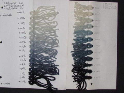
Examples of color gradations. The progressions are exponential rather than arithmetic because the former makes for visually smooth transitions between steps. The samples that follow are from class assignments when I was a graduate student in the M.F.A. program and from classes I taught as a graduate assistant.
Inventing colors is fun. It means coming up with dye formulas. Then, doing gradations of a formula to have a range of values to choose from. Then, doing 2-way color mixes in which you measure dye solution in a 10-step gradation at 1.6 multiples increments for one color (0.025 % – 0.04% – 0.06% – 0.1% – 0.16% – 0.25% – 0.4% – 0.6% – 1.0% – 1.6%), and the same steps for the second color, but in reverse order.
In the above example, “Spring ’85 Toner,” is one of the colors in the 2-way color mix, the second color being Violet Blex. A toner is a color made up of 2 or more colors. “Spring ’85 Toner” is made up of 6 colors, their percentages in the formula all adding up to total 1.0% dye solution–the standard dye solution we used. This toner blend is either cool or warm depending on its ingredients. You can then use this toner as a “color” to mix with another color (as above with Violet Blex) so as to come up with a complex color. These combinations result in more interesting colors than you would have got had you just done a 2-way color mix of 2 plain colors, say Violet Blex + Orange 2GY. From experience, I’ve found that doing a 2-way color mix of 2 toners would often result in muddy colors.

Above left: Martha’s Gray gradation (@ 0.05% strength dye solution); R: 2-way color mix in increments of 1.6 multiples using Martha’s Gray as a toner + Orange GY as the second color.
Another interesting gradation involves using a toner as the variable and a color as a constant. Above, Blooming Stew toner is the variable in increments of 1.6 multiples and Yellow A is the constant at 0.4%.
Above right: again, Blooming Stew toner as a variable and Sky Blue RL as the constant at 0.4% depth of dye.
Above, a 4-way color gradation with Alizarine Blue, Green NBX and Orange 2GY as variables and a toner as the constant. There’s a skip between steps 16 and 17 signaling a goof. Someone in class must not have done his/her part of the assignment (each student was assigned 2 or 3 steps in the gradation).
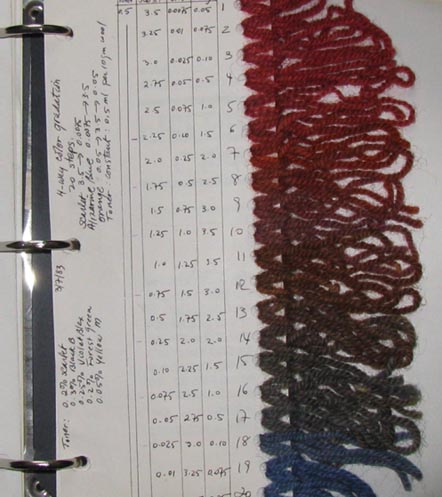
Above, a 4-way color mix gradation in 20 steps with Scarlet, Alizarine Blue and Orange 2GY as variables and a toner as the constant at 0.5% depth of dye.
In my next post I will show how I get mottled colors and how I use them in my work.


