Searching for form in 2-D
February 26, 2012
I sweated my first tufted piece as a graduate student. I wasn’t sure whether I was to work on it independently or after having a conference with Budd Stalnaker about it. Too shy/terrified to talk with him about what I had in mind for it, I proceeded on my own in my home studio.
I retrieved my folder on the piece to find out what I was thinking in the spring of 1983, my first year of graduate studies in the “Woven and Constructed” class at IU. The first page is a row of 16 yarn samples, each tied into a punched hole with the dye formula beside it.

Yarn samples for "For the Fifth Wall"
Next is the dye- stained worksheet of one of the dye sessions that yielded some of the colors I used.

Dye worksheet
Only 4 pots!–a short dyeing session. Two with 300 gms of wool per pot–one to get lilac yarn; the second an over-dye effort undoubtedly to rid myself of what must have been a pink I’d previously dyed but couldn’t see myself using. I added violet blex and red dye solutions to the pot w/ pink yarn. Two pots with 200 gms of wool per pot, each pot with dye for the same blue. I was up to my usual loosey-goosey MO for I see that I made a notation that I’d added some Black B to one of the blue pots….like a cook adding more seasoning to tweak the flavor.
On a second dye worksheet, it appears that I’ve pared down the # of colors to 8 from the original 16.

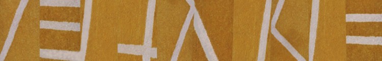
Figuring out amount of yarn and colors needed
A simplified sketch of the rug-to-be tells me that I’d decided on its basic composition. Next to it I’ve written” Love it!” 29 years later, I wish I’d stuck with what I see in this sketch. I’ve divided its area into 3 sections along its long side. One area contains a penciled spiral shape–along one section I’ve written 5′ and further divided that into 3′ and 2′. It appears that I’m figuring out the square footage of that area and its colors to determine how much yarn and what colors I will need to dye.
Next is an empty area with “burgundy = 3′ x 6′ ,” and “8# + 1# above [i.e. for the spiral] = 9#” penned in. I’m puzzled by the # sign because in the dye lab we used the metric system, not pounds (#). A note with an arrow pointing to the 9# of burgundy says “could mix irregularly with violet or black. No–for this one do a plain field.” Ink smears and crossed-out writing cover the page indicating impulsive decision-making–typical. At the bottom I instruct myself to “keep track of how much is used so’s know for next rug dye.”
Beneath the sketch I’ve taped down 7 pieces of different colored yarn with the number of pounds (#) of wool I calculate I’ll need of each: 9# of burgundy + 1# – 2# of the 7 colors. “21#” is circled with the notation “too much?” next to it. I’ve penciled in “yes” next to 21#. Why the # symbol? I suspect it has to do with the weight of the industrial size skeins of wool yarn that we bought from John Wilde Yarns of Philadelphia. We purchased them in bulk by the #. One skein weighed approximately 3#. For dyeing purposes, we wound skeins of yarn weighing 100 grams. For testing of dye formulas, we wound and weighed small skeins of 10 gms and scaled down the dye formula.
A final dyeing-related page shows entries of all the color and amounts of wool I needed. Looks like a summing up after the fact. At the top I read “Off the Wall,” my working title for the rug.

Colors/Yarn used
Which brings up the issue. Why a rug? Why not a piece for the wall? I think my home background had something to do with this. I probably never even considered making a wall piece….almost too much of a challenge because it’s more like “art” and what did I know about art? A rug is accessible and familiar–I could pull that off. Maybe I sensed less expectations, less exposure to criticism. After all, it was “just a rug.”
Rugs, carpets had been big in the home I was brought up in. My mother collected oriental rugs, an interest most likely fed by our living in the Middle East for many years–in Egypt and Pakistan. I recall rug merchants coming to the house with their bundled-up wares…spreading them out on the living room floor as my mother and the merchant sat on the floor around them, choosing and haggling over cups of chai. My mother preferred Persian rugs with their less angular, more organic, viney, fruit and floral designs and deep, lush colors and pile. I recall one merchant in particular bad-mouthed Turkish rugs as inferior products on a knots-per-inch basis and cruder feel or hand. Even then I recall favoring the more geometric look of the Caucasian rugs and of the Turkish rugs.
An example of a Persian rug that would have appealed to my mother.

Feraghan, late XIXth c, "The Oriental Rug Collection of Jerome and Mary Jane Straka," © 1978, The Textile Museum, Washington D.C.
While I can fully appreciate its beauty, my own preference leans more toward the more austere and stark as in the example of a Caucasian rug below. These are shown here as perhaps extreme examples of two differing sensibilities.

Kazak prayer rug, Caucasus, late XIXth/ early XXth c,"Oriental Rugs of the Hajji Babas," Daniel S. Walker, plate 11, ©The Asia Society 1982, Harry Abrams, NY
Also as to “why a rug?” Budd had purchased 9 tufting punch needles as a new tool to experiment with in class. They were made by Rumplestiltskin’s in a light blue plastic casing. They look like a hand-held mixer with a large needle where the beaters go. I will post a separate entry on these punch needles.
In my “For the Fifth Wall” folder, I find several pages of pencil sketches of possible compositions for the rug. These seem to be the extent of my working out my final choice–no exploration of alternative possibilities, unless they ended up as crumpled paper in the trash once I’d settled on the spiral idea.

Sketch 1

Sketch 2
In hindsight, Sketch 2 would have been the better choice than the one I actually chose. I say that because this composition is clear and uncluttered. Hmmm…yet, there’s something unsatisfying about it. Looks like I’m adamant about juxtaposing a field of plain color with the spiral. It’s interesting that the circling shape the spiral creates here takes on a rectangular aspect conforming itself to the rectangular shape of the rug. The innards are being shaped and contained by the edges of the piece. It’s as though I were trying to push a round peg into a square hole. Interesting. Why didn’t I opt for a circular rug? Probably because that’s too easy….I needed that tension, that struggle for accommodation, adaptation.

Sketch 3
Sketch 3 has too much going on in a much-ado-about-nothing manner. That Z-line breaks off from the spiral and submerges itself under the “burgundy” area. Other lines do likewise and the spiral aborts. The resulting linear mess lacks clarity and is not satisfying on any level. The smaller spiral in the corner seems isolated and unrelated to the center one. A rectangular shape sticks out from the central spiral area, invading the “burgundy” area–a spin-off peninsula. What are those 2 parallel lines dividing that peninsula all about? It’s as though I were going to replicate the larger whole in this off-shoot. The shape remains in the final rug and I think it is foreign and unjustified–I regret keeping it. But it is an example of my tendency to throw a monkey wrench into the works to mess things up. I always want something to kind of spoil the works or distract from the large picture. Contrariness perhaps.

Sketch 4
Sketch 4 is more assured and is probably the one I chose to follow. The “foreign” protrusion here seems more like it belongs. The upper lines of the central spiral aren’t satisfyingly resolved, however, in that they don’t continue the spiral within the confines of the area I’ve allotted to it. They run parallel to the length of the rug. These sketches are just suggestions as to the general skeleton of the composition. As I work on the piece, the design will take on a life of its own and my sense of what colors to reach for and where to take them will build on what’s happening during the making process.

Sketch 5
Sketch 5 was obviously drawn after I’d made the piece. The “foreign” shape remains and is out of character with the rest of the piece in color (blues and lilac). It is a smaller version of the larger composition that contains it. I find no way of justifying its presence, but there it is. I kept it to have something off-kilter that compromises the composition deliberately. I find I do this sort of thing repeatedly and on purpose.
I’d settled on a spiral as the central motif. My decision might have had to do with the tufting process itself. The needle tufts loops in a continuous line. I can see myself starting a line and following wherever the needle takes me–guided, of course, by me, but where would I take it? I could just wander the line aimlessly and hope something would appear that might suggest to me some controlling idea. But that approach is too random–I needed a structure to anchor and suggest the composition. Making a spiral shape resolves that problem…I’d just keep the spiral widening ever more and fill in gaps later.
Another decision was to have a space of solid color—reds from the original swirl–so as to have a contrasting, less frenetic area to contain it. The red yarns I used to fill this space are from dye sessions in which I was loosey-goosey and crowded the dye pot with skeins of yarn and didn’t stir the pot as they absorbed the red dye formula. I was slap-dash about measuring as I added the dye solutions to the dye pots. I deliberately went for mottled, variegated skeins. During the tufting process, I randomly picked which red skein to use once each one got used up. I was not looking for smooth transitions between reds. The result is a mess of reds–some moire effects, some sharp breaks in continuity with adjacent areas of red.
Crit day arrived and I unrolled “For the Fifth Wall” on the floor for all to tear to pieces.

6' x 8,' tufted wool pile/ cotton backing/ acid dyes
Budd stood next to me as we looked down at my rug. He had his arms crossed, his left hand cupping his right elbow and he’d raise his right hand and futzed with his chin. In shorts and sweat shirt in the dead of winter, he shifted from leg to leg, uncomfortable with what he beheld and searching for the right approach to convey that to me. “There’s four or five rugs here,” he said, or some such to that effect. Squirm. That instantly became so obvious to me that I wondered what I’d been thinking–or not. Others piped in with unretrievable-from-memory comments. Another comment of Budd’s at the time had to do with the mottled reds in the large field of color. He said that I might consider using mottled yarn as a signature or identifying material making it recognizable as my work. I did continue to use it through the late ’80s, but judiciously and not consistently.
Looking down at the whirlpool swirls of color, the other Budd comment that stuck with me was, and I paraphrase. “This spiral device is often indicative of a search for form.” At the time I wasn’t sure what he meant by “search for form,” and I didn’t have–should have had!–the gumption to ask him. After all, what was I there for? But I didn’t want to reveal the depth of my ignorance. I didn’t know the difference between shape and form. I didn’t have that art background (see write-up in an earlier post on September 7, 2008) so was just starting to pick up on art-speak. I stashed his comment away to chew on later.
I eventually came to see the truth of his comment: that the spiral line, which emanated from a starting point, circled that point, widening its expanding trajectory with its forward motion as it filled more and more space seeking some kind of resolution. Its path from the center outward was its own resolution—it just kept going until it petered out or ran out of space by bumping into the wood frame that supports and stretches the cotton backing, my canvas. I seem to have made no real decision other than to follow the tip of the line as it left its tail of color behind.

"For the Fifth Wall," detail
In hindsight, I like to think that he recognized that I intuited a need for some sort of structure on which to build my composition. I wasn’t just placing shapes here and there willy nilly. So that’s a positive sign that I was on the right track. This need for an underlying structure has always been present in my work–intuitively. I’ve felt the need for it. On a rational level, it justifies what goes on in the piece…from the zigzag lines whose elbows stick out beyond the borders of a piece (“Blackberry Winter”)

"Blackberry Winter I," ©1985, 73" x 37," tufted wool pile/ cotton backing/ acid dyes
to the scalloped edges that define and contain the energy channeled through chutes of directional pattern and color (“Constrictor Constrictor”).

"Constrictor Constrictor," © 1984, 74" x 96," tufted wool pile/ cotton backing/ acid dyes
The jutting-out-elbows and the scallop edges aren’t imposed on the composition. In fact, I recall that before conceiving the design for “Constrictor Constrictor,” I knew that I wanted to use scallop edges. They seemed so textilian so I found a way to incorporate them into the structure. I devised a way to justify them. They became the structure, actually, as the energy flowing in their direction “rounds the bend” of the scallop and is contained and redirected into the piece and goes hurdling toward the opposite edge. My 4th rug and first with irregular edges.
I’d found form!
Dyeing Mottled Colors…more on dyeing at IU
January 12, 2012
Where was I?…My last entry was September, 2008. It’s now January of 2012! Sorry to have left dangling those of you following my notes about dyeing yarn especially since I’d set up expectations for my next entry on mottled colors. I hadn’t realized how much thought and time would go into writing about my experiences as an artist making art. Writing was taking time away from art making itself as well as from other claims on my time. Plus I hadn’t intended on writing about the technical aspects of art making–such as dyeing wool–because it doesn’t interest me as much as writing about the art making process itself, and more important to me, about the finished object itself. More on this eventually…
Recently I got an email from someone who happened upon my dyeing entry and had gone through the MFA program in textiles at Indiana University in the ’90s. My earlier notes rang true to his experience there and led to his contacting me. I realized there was more I had to say about dyeing yarn…mottled yarn.
In Budd Stalnaker’s Woven and Constructed studio classes, we had to gain expertise of the technical side of different textile processes. For example, in weaving: basics, like how to dress the loom; how to achieve even selvages by control of the sideways pull of the weft; various weft joining techniques and edge finishings. In dyeing wool yarn: how to achieve even, level colors; make dye solutions; do 2-3-way color mixes; achieve complex colors through the use of toners; etc. All these took practice and patience to achieve control.
Impatience is one of my most endearing traits–and it sometimes leads to road blocks as I work be it while dyeing yarn, cutting shapes out of yardage, composing or constructing a piece. More often than I care to admit, I find that I have to re-do or unravel or re-cut or re-measure due to impulsive actions–not looking before I leap. “What have I done? Now what do I do?” The problems it creates for me are challenges I love to work out: how to extricate myself out of this hole.
Early in learning how to dye wool yarn in the dye lab, I noticed that some of my colors turned out blotchy, streaked, or variegated. Not good since the aim was level, even colors. This result was unexpected…“What went wrong?” Being an impatient dyer, I’d strayed away from the do’s and don’ts. While the dye pots simmered over the gas flames and the yarn was absorbing the dye, I’d gone off to do something else to make good use of my time. Every so often I’d run back to the burners to check on progress and give the yarn a stir . I’d crowded the pots with many skeins of yarn so’s to cut down on the number of dye sessions–the more skeins to a pot, the less pots to dye.
This loosey goosey approach to dyeing practically guaranteed I’d end up with problems. I figured out what went wrong: I hadn’t kept the skeins of yarn from bunching up against each other in the dye bath nor had I diligently stirred the dye pot for umpteen minutes while the wool absorbed the dye. Hence the wool couldn’t absorb the dye–not evenly. Crowded skeins do not allow the dye to penetrate the fibers freely and evenly and the lack of stirring contributed to this fiasco. It reminded me of Julia Child’s advice not to crowd the pan with whatever you are sauteing or browning because by crowding you end up steaming the food–a different cooking process which produces different results . I got unintended results rather than predictable ones–the whole point of being in control of the dye process.
Once I’d rinsed and dried and wound the yarn into balls, I had to make use of it. I couldn’t let that splotchy yarn go to waste (my third world background in which you find a use for everything), but how was I to make lemonade out of lemons? The goof, it turns out, was serendipitous good luck.
For me, the most exciting part of a project is to recognize a technical or aesthetic glitch when it occurs–what’s gone awry in the process, composition or construction–and turn it to my advantage. I get great satisfaction in making pluses out of minuses–being able to salvage–better yet, to improve on the color or the shape or the line by incorporating the glitch and following where it might take me, or by tweaking it so that it becomes an intended and integral part of the process and end product.
I used this yarn to tuft a section of a piece letting the ball unravel as line by tufted line I filled a shape with color. The result was an area of irregular color, often with a moire effect. Hmmmmmmm…. interesting! I recognized that these mottled areas added visual texture and complexity to that shape. Looking at the larger composition-in-progress, I could see that the mottling effect actually contributed to what I wanted my work to express. The splotchy areas of color convey messiness, capriciousness, randomness, whereas the areas with level, even, “perfect” colors convey control, precision and order. I had inadvertently hit upon an additional way to represent chaos in my compositions–the “chaos” in the play of chaos versus order that I feel and want to express. By seeing this possibility in the mottled hues, I’d inadvertently improved the piece. The key was recognizing the blotches for what they were…chaos. By looking and noticing I was seeing what was in front of me. Now you know why, when needed, I dye blotchy colors.

"Peruvian Lattice," ©1988 Martha Donovan Opdahl, 60" x 120", tufted wool yarn/ cotton backing/ acid dyes. Notice areas of mottled colors. Yessss!

Detail of "Peruvian Lattice." Mottling and moire effects are more visible here.

"Trio Incognito," ©1987 Martha Donovan Opdahl, 74" x 77,"tufted wool pile/ cotton backing/ acid dyes

Detail: "Trio Incognito." Mottled and moire effects contained by the geometric shapes = chaos/order
An added bonus: It turns out that this messed-up yarn was a perfect fit for my impatient way of working. I took to deliberately crowding the yarn in the dye pots and to being even careless and slap-dash in measuring the dye solution into the dye bath. So what if the yarn from pot A which “should” have matched the yarn in pot B didn’t–it’s close enough. The result was intentional. Plus I was inconstant in stirring the pot. I was totally irreverent toward the haloed rules. My method matched my purpose and it felt right–I made my impatience work for me.
Complex Colors, Toners, Hand-Dyed
September 28, 2008
What follows is more technical than what I had originally intended, but some viewers of my work might want to know about my colors. It turns out that the dye process, as I do it, contributes directly to the look of my tufted pieces. Since I hand-dye the wool I use, how I achieve particular characteristics of the colors I use adds another level of understanding and appreciation of the work. The colors also convey the meaning of the work–more about this in my next post.
I learned the dyeing process in Budd Stalnaker’s woven and constructed class at IU. I also learned how to dress a floor loom and how to weave, but I had no aptitude for it and lost interest. I discovered the tufting construction process which suited my looser and more improvisational approach to a T.
The pillars of Budd’s teaching were the grid and color gradations. Dyeing was an integral part of the program. We learned to master the dye process and have total control of our colors and the ability to reproduce them. Predictability is key. Being able to reproduce them is one of several reasons we used acid dyes instead of vegetable dyes which lack this trait. A dye’s color intensity, among other variables, is determined by the plant’s growing season length, whether or not it suffered through a drought, where it was grown, and when it was harvested. With acid dyes those variables disappear. You can be confident that if you need to come up with color X six months from now or 10 years from now, you’ll be able to reproduce it exactly. Other reasons to opt for acid dyes on wool is their intensity, their color fastness (depending on the color–some are more colorfast than others), and their washfastness. For my own work, I stuck to acid dyes when I set up a dye lab in my studio.
We were taught how to dye even, level colors–like what you’d get from a professional dyeing facility. No streaking. No felting. No mottling. If you want to weave 4 square feet of color X, you can be confident that you can dye a level color X. This is important because some projects call for more yarn than can be dyed in one dye pot, or perhaps even in one dyeing session using several dye pots. Experienced dyers know this, but for the uninitiated I’ll explain. Level colors require one to be exact in measuring the dye solution quantities in the formula (think of the formula as a color recipe) into the dye bath. You must be alert to the temperature of the water heating in the dye pot and add dyes and acids at prescribed intervals. You must not crowd the pot with yarn skeins so that they can float freely without twisting or binding. Otherwise, the yarn is unable to evenly absorb the dye. And, you must stand by the simmering dye pots and stir the yarn for 45 minutes so that the dye and chemicals are evenly distributed and fully absorbed. There are further steps, but these suffice for my purposes here.
Examples of color gradations. The progressions are exponential rather than arithmetic because the former makes for visually smooth transitions between steps. The samples that follow are from class assignments when I was a graduate student in the M.F.A. program and from classes I taught as a graduate assistant.

color gradations

6x6 gradation: Yellow M constant; Violet Blex variable

7x7 grid:Fast Green 2GN constant; 1984 toner variable

7x7 grid:Fast Green 2GN constant;Orange Y variable
Inventing colors is fun. It means coming up with dye formulas. Then, doing gradations of a formula to have a range of values to choose from. Then, doing 2-way color mixes in which you measure dye solution in a 10-step gradation at 1.6 multiples increments for one color (0.025 % – 0.04% – 0.06% – 0.1% – 0.16% – 0.25% – 0.4% – 0.6% – 1.0% – 1.6%), and the same steps for the second color, but in reverse order.

2-way color mix:Spring Toner + Violet Blex
In the above example, “Spring ’85 Toner,” is one of the colors in the 2-way color mix, the second color being Violet Blex. A toner is a color made up of 2 or more colors. “Spring ’85 Toner” is made up of 6 colors, their percentages in the formula all adding up to total 1.0% dye solution–the standard dye solution we used. This toner blend is either cool or warm depending on its ingredients. You can then use this toner as a “color” to mix with another color (as above with Violet Blex) so as to come up with a complex color. These combinations result in more interesting colors than you would have got had you just done a 2-way color mix of 2 plain colors, say Violet Blex + Orange 2GY. From experience, I’ve found that doing a 2-way color mix of 2 toners would often result in muddy colors.

Above left: Martha’s Gray gradation (@ 0.05% strength dye solution); R: 2-way color mix in increments of 1.6 multiples using Martha’s Gray as a toner + Orange GY as the second color.

Blooming Stew Toner; Blooming Stew variable+YellowA constant

Another interesting gradation involves using a toner as the variable and a color as a constant. Above, Blooming Stew toner is the variable in increments of 1.6 multiples and Yellow A is the constant at 0.4%.

Blooming Stew gradation, left; as variable+Sky BlueRL as constant
Above right: again, Blooming Stew toner as a variable and Sky Blue RL as the constant at 0.4% depth of dye.

4-way color mix with toner as constant at 0.05% depth of dye
Above, a 4-way color gradation with Alizarine Blue, Green NBX and Orange 2GY as variables and a toner as the constant. There’s a skip between steps 16 and 17 signaling a goof. Someone in class must not have done his/her part of the assignment (each student was assigned 2 or 3 steps in the gradation).

4-way color gradation with toner as constant at 0.5% depth of dye
Above, a 4-way color mix gradation in 20 steps with Scarlet, Alizarine Blue and Orange 2GY as variables and a toner as the constant at 0.5% depth of dye.
In my next post I will show how I get mottled colors and how I use them in my work.
Finding my way to art school
September 7, 2008
I did not come to making art from an art background. I got into art through the back door, so to speak, when I was in my thirties.
Growing up, I was exposed to every kind of stitchery having been born and brought up in Peru and elsewhere where such domestic needle skills are handed down from mother to daughter (are they still?) My Spanish grandmother was a stitching whiz. She could glance at a sweater and figure out how to knit it. Ditto with the crochet hook. She was also inventive: she knitted, crocheted, and embroidered on the fly–no notes, no pattern– everything skillfully made. Her house had a cuarto de costura–a sewing room–where her fabrics, yarns, and sewing basket were kept in a large armoire next to her sewing machine. I was very young then, yet remember whiling away afternoon hours there and having tea with my aunts or whoever had come by for a visit. I can bring back that special cozy feeling of contentment and warmth that room meant to me. Yet I myself wanted nada to do with sewing…I was a tomboy and couldn’t be less interested. Looking back: what a waste!
My early schooling did not include art classes—they weren’t offered. I take that back. In a junior high class in Bolivia I’d worked forever on a needlepoint project for the labores manuales class. It entailed filling in the background–in a mind-numbing beige yarn which came with the kit–of a pre-stitched figure of a bonnetted Victorian woman dressed in blue. I hated working on it. The teacher called me Penelope referring to the mythological character who every night for twenty years pulled out what she’d stitched during the day so as to thwart the advances of suitors as she delayed the completion of her project in anticipation of her husband’s return from the war.
Not having gone to school in the US (other than second grade), where by the time you are in high school you are thinking about college and about a career, I didn’t realize there were major choices to be made….that I could shape my life. I simply didn’t think in those terms for I’d never had to make such choices. I pretty much dutifully did as I was told. In hindsight, I’m aghast at my cluelessness. Such an ingenue! What was I thinking? Mostly, of getting educated, but not much beyond that.
Fast forward to undergraduate years. At the University of Wisconsin-Madison, I’d loved my freshman and sophomore years. I took courses from some inspired teachers: Prof. Frazer in Zoology, my first big lecture course; Prof. Alvin Whitley’s mesmerizing lectures on Romantic Poetry; Prof. Whelan’s (sp?) philosophy course in which I first encountered phenomenology. I didn’t consider taking art courses other than an art history class from an extraordinarily handsome and meticulously, starchedly dressed young professor who taught in the dark showing slides of Baroque painting toward which I’ve had a visceral revulsion to this day. Voluptuous female figures in unnatural, tippy-toed poses; picnic scenes of overdressed period characters; stage backdrop landscapes of peaks in distant misty blue. That negative art history experience did not encourage me to take more classes in art.
One summer session, I had a roommate from New York. She was taking a sculpture class and one day brought back to the dorm a maquette she was working on–a clay self-portrait. I was intrigued and incredulous: she was taking a college course that didn’t involve grinding reading and writing. She never had reading assignments nor a paper due. The world of studio art was unknown to me. Could students take such classes and make something out of a clump of clay for credit? The first and last time I’d done that was with Play Doh in nursery school. She seemed ordinary enough though more sophisticated and learned in music and art than I was. She didn’t look like what I’d imagined an artist should look like and dress like. She was my roommate and made art? Weren’t artists a breed apart?…geniuses?…in outre get-ups? How did she know she was an artist, or was it pure chutzpah on her part to aspire to be one? Where did she get ideas of what to make? Yet, here she was modeling a bust of herself–the problem of what to make solved. Perhaps making art was something one did during summer session. I wished I’d heard about it though with no experience in making art, I wouldn’t have dared to sign up.
The academic side of my junior and senior years at UW was a disappointment. My gringo father suggested I consider Hispanic Studies as a course of studies. He believed, with good intentions, that I ought to learn about my Spanish heritage. I dutifully declared my major. I took courses in Spanish and Latin American literature, civilization, and history by some pedantic scholars. The exception that stands out was a history course taught by Professor Philip Curtin whose interest was the African slave trade. He was thoroughly knowledgeable about his subject, passionate about ideas, and incisively clear thinking. He wholly engaged the students (most of whom were graduate students) for an intense, cerebral hour. Other than that course, I was not satisfied with my major, but I didn’t have the wit to switch.
Coda: Curious to know what had become of Prof. Curtin, I did a quick google search. It turns out he’s a highly respected historian who has caused seismic shifts in the focus of research on Africa. He’s written many influential and oft-quoted books. He shook things up with his sometimes controversial views as, for example, the historical relevance of oral tradition in Africa. Among his many honors, he’s a MacArthur Fellow! And he’s Professor Emeritus at Johns Hopkins University. Bravo Professor Curtin! I should have switched my major to African Studies!
In the Latin American context of classes I took (excluding Curtin’s), “civilization” began in 1492 with the arrival of the Spaniards. Whatever had occurred before was the dark ages. I got the distinct impression that what went before was not being studied nor worth studying since they were “primitive” cultures. Yet, actually, archaeologists, anthropologists, folklorists, and ethnobotanists were making discoveries along river valleys in the arid coast of Peru. They dug through middens counting unearthed beans and corn kernels and fish bones to determine food sources, harvests, droughts, and population sizes and movements; they unwrapped mummy bundles in grave sites finding clues to specialized classes of weavers which pointed to priestly hierarchies of rulers. Folklorists studied the oral traditions of ancient myths from pre-conquest times as written down by post-conquest scribes. There must have been university courses that covered these subjects, but I didn’t know about them. I would have loved to have studied them for I’d been brought up in the Andes in the midst of Quechua and Aymara Indians and felt an affinity for their cultures. I wish I’d learned to speak Quechua as a child, but now I see that such a notion then was unthinkable being of a class that denigrated the natives.
I also lacked the confidence to “follow my bliss” because I didn’t know what my bliss was. In retrospect, I was floundering. Through a process of elimination, I was beginning to find out what didn’t appeal to me. And by default and unawares–for I was not consciously seeking something to dedicate my life to—I was discovering what I had no passionate interest in nor natural ability for.
Fast forward to post-college years. I moved to Indiana with my professor husband (who I had met at UW) to a small college town where I dedicated myself to bringing up our two children. I hadn’t done much sewing other than mending torn jeans, replacing broken zippers and lost shirt buttons. Early in my marriage, my husband gave me the book Crafts Design by Moseley, Johnson and Koenig, which I still have. He realized I was searching for something I could apply myself to. My first effort at handicraft was to make a hooked throw rug (nesting?) using Aunt Lydia’s acrylic yarn from Woolworth’s. I made up the simple design–2 rows of a repeated orange escutchion on a solid green ground. B-o-r-ing. It reminded me of the tedious needlepoint effort in junior high. The rug’s colors were dull; the yarn had no spring to it for the pile matted down where stepped on.
It’s interesting that during those years my creative outlet found its way to textiles in one way or another. I dabbled in various sewing projects as a hobby learning techniques from library books. Before long I got my own books–mostly how-to books. An early purchase was Erica Wilson’s Embroidery Book which I still use for reference. I appliqued and embroidered baby quilts for the nursery wall based on Mother Goose rhymes. I stitched dolls and felt Christmas tree ornaments from patterns in magazines like Woman’s Day that I’d pick up at the supermarket checkout counter. A couple of useful books were Jean Laury’s on applique followed by Beth and Jeff Gutcheon’s inspiring book on making quilts (both of these I loaned to someone long ago and never got back–grrrr). The Gutcheon book drew me in the direction of quilts. I pieced traditional quilt blocks which eventually led to my developing original designs. For awhile I was enamored of trapunto and made several white pillows and wall hangings.

Jack in the Box, detail. Trapunto.
Needing pin money to help finance my needlework–but mostly to make space for new projects–one October I rented space for a booth at the week-long Covered Bridge Festival in nearby Mansfield. It was a particularly cold and wet week, but I sold some quilts which made the effort worthwhile.
Probably my most ambitious project was learning how to silk screen on fabric (can’t recall which book taught me the basics). I designed a series of animals that I silk-screened on a one-yard square of muslin. The animals were in pattern pieces, to be cut out, sewn together and stuffed with polyfill. It had been exacting work to figure out the patterns so as to get a fully realized 3-D boa constrictor or whale or rhinoceros or elephant when the corresponding pieces were sewn together. In truth, I preferred to look at the fragmented parts inked on the muslin square pinned to a wall more than the finished stuffed animal. Something about the 2-D sharp and abstract silhouettes of the patterns appealed to me. They are as close to being art objects as anything I’d made till then. I could just as easily have silk-screened drawings on paper, but fabric was the draw and fragmented patterns the means.

Constrictor Constrictor ©1975 silk screen on muslin, 40"x40"
In 1977, I participated in a national quilt contest–the “Flower Garden Quilt Contest”–sponsored by the Indianapolis Star newspaper. It was my first entry into a juried show. The contestants were each to produce a quilt based on a set of 24 flower designs by Ruby McKim. You could stitch them any way you liked, but the sponsors wanted contemporary interpretations–not what your grandmother would have made. I decided on bold, solid colors using a reverse applique technique to render stylized versions of the traditional McKim designs. I was influenced by “The Rockefeller Quilt” designed by Dorothy Weatherford, designer for the Mountain Artisans Cooperative of West Virginia. (That quilt was a gift from the quilters to Sharon Percy Rockefeller for her support in their efforts to establish and maintain their cooperative.) The Flower Garden contest drew many beautiful and inventive entries. In the end, I won first place with mine, which disgruntled many. Yet one viewer at the show declared it was “the only contemporary quilt” there. It was a welcome compliment amidst the dissenting noise. Coda: The quilt was purchased by Sharon Rockefeller.

Flower Garden ©1977 cotton/poly 118"x104"
By now I’d grown restless. Women were seeking fulfillment outside the home. Feminism was in the air and I was receptive to its message. Domesticity and female handiwork were out; careerism and using one’s brain were in. Stirrings of dissatisfaction percolated–of something missing or my missing out. Taking care of the children was becoming less demanding now that they were in school. I had time on my hands. I knew I could be accomplished at something…but what? I didn’t want to pursue stitchery because it couldn’t shake the perception of its being a hobby. In addition, it had all that baggage of female domesticity–the taint of brainless women’s work. Getting a brainy advanced degree seemed doable and the way to go with Indiana University (IU) being fairly close (Bloomington is an hour’s drive from our house). And my husband would be taking a sabbatical year off from teaching so he could cover the home front while I was away during the day. I discovered that IU offered courses in authocthonous cultures…Andean even. I got curious…
Looking through the IU graduate courses offerings, I find that so-called “primitive” cultures are a legitimate field of study. I was elated. I signed up for courses toward an M.A. degree in Latin American Studies intending to study pre-Columbian subjects. What I “would do with it” I wasn’t sure…something would develop. My husband was agreeable to this venture so off I went, commuting daily to Bloomington. I studied hard for I’m a grind. Andean textiles caught my eye–their colorful and orderly abstraction and stylization. At the suggestion of my advisor, Professor Roy Sieber, I signed up for a beginning weaving course with Budd Stalnaker in the Fine Arts School to learn the nuts and bolts of how textiles are made. Unbeknownst to me at the time, this course would change my life.
Budd’s interests lay beyond the mechanics of cloth-making (though he was a bear about teaching the techniques and the students’ mastery of the loom and dyeing). His was an art studio class and Aesthetics was his numero uno concern. He knew more about color than most artists and had an incredibly discerning eye. Teaching us how to see by way of leading questions was a central part of class critiques. I soon realized that more was expected of me than producing even selvages.
These are samples of early tapestry class assignments. They’re 3″ x 3″ studies in 2-ply wool yarn on a linen warp, my first serious creative efforts in fiber. Each was my solution to an assigned problem. Baby steps.

Tapestry samples from beginning weaving and dye course
I’d never thought of weaving as brain work, yet all the assignments in “Beginning Woven and Constructed” involved problem-solving of a kind I found to be challenging and satisfying work. I’d never thought of myself as an artist; making art was what artists did. Yet in the Fine Arts building I was among people who took making art seriously and discussed aesthetics on a higher plane than as mere technique. It was a revelation to me that others responded as I did to, say, a red mark on a black ground. They didn’t just respond to such an aesthetic experience, but dedicated their lives to making such marks. I was home.
I decided to apply to the MFA program in fiber. I recall the interview I had with Budd in which he seemed concerned about my being able to switch from a verbal to a visual vocabulary. For whatever reasons, he accepted me into the graduate program. I now think that I was always a visual person but had been living in a verbal universe. I’d been a fish out of water. Now I was in my element and Budd was offering me a chance to swim.


