Searching for form in 2-D
February 26, 2012
I sweated my first tufted piece as a graduate student. I wasn’t sure whether I was to work on it independently or after having a conference with Budd Stalnaker about it. Too shy/terrified to talk with him about what I had in mind for it, I proceeded on my own in my home studio.
I retrieved my folder on the piece to find out what I was thinking in the spring of 1983, my first year of graduate studies in the “Woven and Constructed” class at IU. The first page is a row of 16 yarn samples, each tied into a punched hole with the dye formula beside it.

Yarn samples for "For the Fifth Wall"
Next is the dye- stained worksheet of one of the dye sessions that yielded some of the colors I used.

Dye worksheet
Only 4 pots!–a short dyeing session. Two with 300 gms of wool per pot–one to get lilac yarn; the second an over-dye effort undoubtedly to rid myself of what must have been a pink I’d previously dyed but couldn’t see myself using. I added violet blex and red dye solutions to the pot w/ pink yarn. Two pots with 200 gms of wool per pot, each pot with dye for the same blue. I was up to my usual loosey-goosey MO for I see that I made a notation that I’d added some Black B to one of the blue pots….like a cook adding more seasoning to tweak the flavor.
On a second dye worksheet, it appears that I’ve pared down the # of colors to 8 from the original 16.

Figuring out amount of yarn and colors needed
A simplified sketch of the rug-to-be tells me that I’d decided on its basic composition. Next to it I’ve written” Love it!” 29 years later, I wish I’d stuck with what I see in this sketch. I’ve divided its area into 3 sections along its long side. One area contains a penciled spiral shape–along one section I’ve written 5′ and further divided that into 3′ and 2′. It appears that I’m figuring out the square footage of that area and its colors to determine how much yarn and what colors I will need to dye.
Next is an empty area with “burgundy = 3′ x 6′ ,” and “8# + 1# above [i.e. for the spiral] = 9#” penned in. I’m puzzled by the # sign because in the dye lab we used the metric system, not pounds (#). A note with an arrow pointing to the 9# of burgundy says “could mix irregularly with violet or black. No–for this one do a plain field.” Ink smears and crossed-out writing cover the page indicating impulsive decision-making–typical. At the bottom I instruct myself to “keep track of how much is used so’s know for next rug dye.”
Beneath the sketch I’ve taped down 7 pieces of different colored yarn with the number of pounds (#) of wool I calculate I’ll need of each: 9# of burgundy + 1# – 2# of the 7 colors. “21#” is circled with the notation “too much?” next to it. I’ve penciled in “yes” next to 21#. Why the # symbol? I suspect it has to do with the weight of the industrial size skeins of wool yarn that we bought from John Wilde Yarns of Philadelphia. We purchased them in bulk by the #. One skein weighed approximately 3#. For dyeing purposes, we wound skeins of yarn weighing 100 grams. For testing of dye formulas, we wound and weighed small skeins of 10 gms and scaled down the dye formula.
A final dyeing-related page shows entries of all the color and amounts of wool I needed. Looks like a summing up after the fact. At the top I read “Off the Wall,” my working title for the rug.

Colors/Yarn used
Which brings up the issue. Why a rug? Why not a piece for the wall? I think my home background had something to do with this. I probably never even considered making a wall piece….almost too much of a challenge because it’s more like “art” and what did I know about art? A rug is accessible and familiar–I could pull that off. Maybe I sensed less expectations, less exposure to criticism. After all, it was “just a rug.”
Rugs, carpets had been big in the home I was brought up in. My mother collected oriental rugs, an interest most likely fed by our living in the Middle East for many years–in Egypt and Pakistan. I recall rug merchants coming to the house with their bundled-up wares…spreading them out on the living room floor as my mother and the merchant sat on the floor around them, choosing and haggling over cups of chai. My mother preferred Persian rugs with their less angular, more organic, viney, fruit and floral designs and deep, lush colors and pile. I recall one merchant in particular bad-mouthed Turkish rugs as inferior products on a knots-per-inch basis and cruder feel or hand. Even then I recall favoring the more geometric look of the Caucasian rugs and of the Turkish rugs.
An example of a Persian rug that would have appealed to my mother.

Feraghan, late XIXth c, "The Oriental Rug Collection of Jerome and Mary Jane Straka," © 1978, The Textile Museum, Washington D.C.
While I can fully appreciate its beauty, my own preference leans more toward the more austere and stark as in the example of a Caucasian rug below. These are shown here as perhaps extreme examples of two differing sensibilities.

Kazak prayer rug, Caucasus, late XIXth/ early XXth c,"Oriental Rugs of the Hajji Babas," Daniel S. Walker, plate 11, ©The Asia Society 1982, Harry Abrams, NY
Also as to “why a rug?” Budd had purchased 9 tufting punch needles as a new tool to experiment with in class. They were made by Rumplestiltskin’s in a light blue plastic casing. They look like a hand-held mixer with a large needle where the beaters go. I will post a separate entry on these punch needles.
In my “For the Fifth Wall” folder, I find several pages of pencil sketches of possible compositions for the rug. These seem to be the extent of my working out my final choice–no exploration of alternative possibilities, unless they ended up as crumpled paper in the trash once I’d settled on the spiral idea.

Sketch 1

Sketch 2
In hindsight, Sketch 2 would have been the better choice than the one I actually chose. I say that because this composition is clear and uncluttered. Hmmm…yet, there’s something unsatisfying about it. Looks like I’m adamant about juxtaposing a field of plain color with the spiral. It’s interesting that the circling shape the spiral creates here takes on a rectangular aspect conforming itself to the rectangular shape of the rug. The innards are being shaped and contained by the edges of the piece. It’s as though I were trying to push a round peg into a square hole. Interesting. Why didn’t I opt for a circular rug? Probably because that’s too easy….I needed that tension, that struggle for accommodation, adaptation.

Sketch 3
Sketch 3 has too much going on in a much-ado-about-nothing manner. That Z-line breaks off from the spiral and submerges itself under the “burgundy” area. Other lines do likewise and the spiral aborts. The resulting linear mess lacks clarity and is not satisfying on any level. The smaller spiral in the corner seems isolated and unrelated to the center one. A rectangular shape sticks out from the central spiral area, invading the “burgundy” area–a spin-off peninsula. What are those 2 parallel lines dividing that peninsula all about? It’s as though I were going to replicate the larger whole in this off-shoot. The shape remains in the final rug and I think it is foreign and unjustified–I regret keeping it. But it is an example of my tendency to throw a monkey wrench into the works to mess things up. I always want something to kind of spoil the works or distract from the large picture. Contrariness perhaps.

Sketch 4
Sketch 4 is more assured and is probably the one I chose to follow. The “foreign” protrusion here seems more like it belongs. The upper lines of the central spiral aren’t satisfyingly resolved, however, in that they don’t continue the spiral within the confines of the area I’ve allotted to it. They run parallel to the length of the rug. These sketches are just suggestions as to the general skeleton of the composition. As I work on the piece, the design will take on a life of its own and my sense of what colors to reach for and where to take them will build on what’s happening during the making process.

Sketch 5
Sketch 5 was obviously drawn after I’d made the piece. The “foreign” shape remains and is out of character with the rest of the piece in color (blues and lilac). It is a smaller version of the larger composition that contains it. I find no way of justifying its presence, but there it is. I kept it to have something off-kilter that compromises the composition deliberately. I find I do this sort of thing repeatedly and on purpose.
I’d settled on a spiral as the central motif. My decision might have had to do with the tufting process itself. The needle tufts loops in a continuous line. I can see myself starting a line and following wherever the needle takes me–guided, of course, by me, but where would I take it? I could just wander the line aimlessly and hope something would appear that might suggest to me some controlling idea. But that approach is too random–I needed a structure to anchor and suggest the composition. Making a spiral shape resolves that problem…I’d just keep the spiral widening ever more and fill in gaps later.
Another decision was to have a space of solid color—reds from the original swirl–so as to have a contrasting, less frenetic area to contain it. The red yarns I used to fill this space are from dye sessions in which I was loosey-goosey and crowded the dye pot with skeins of yarn and didn’t stir the pot as they absorbed the red dye formula. I was slap-dash about measuring as I added the dye solutions to the dye pots. I deliberately went for mottled, variegated skeins. During the tufting process, I randomly picked which red skein to use once each one got used up. I was not looking for smooth transitions between reds. The result is a mess of reds–some moire effects, some sharp breaks in continuity with adjacent areas of red.
Crit day arrived and I unrolled “For the Fifth Wall” on the floor for all to tear to pieces.

6' x 8,' tufted wool pile/ cotton backing/ acid dyes
Budd stood next to me as we looked down at my rug. He had his arms crossed, his left hand cupping his right elbow and he’d raise his right hand and futzed with his chin. In shorts and sweat shirt in the dead of winter, he shifted from leg to leg, uncomfortable with what he beheld and searching for the right approach to convey that to me. “There’s four or five rugs here,” he said, or some such to that effect. Squirm. That instantly became so obvious to me that I wondered what I’d been thinking–or not. Others piped in with unretrievable-from-memory comments. Another comment of Budd’s at the time had to do with the mottled reds in the large field of color. He said that I might consider using mottled yarn as a signature or identifying material making it recognizable as my work. I did continue to use it through the late ’80s, but judiciously and not consistently.
Looking down at the whirlpool swirls of color, the other Budd comment that stuck with me was, and I paraphrase. “This spiral device is often indicative of a search for form.” At the time I wasn’t sure what he meant by “search for form,” and I didn’t have–should have had!–the gumption to ask him. After all, what was I there for? But I didn’t want to reveal the depth of my ignorance. I didn’t know the difference between shape and form. I didn’t have that art background (see write-up in an earlier post on September 7, 2008) so was just starting to pick up on art-speak. I stashed his comment away to chew on later.
I eventually came to see the truth of his comment: that the spiral line, which emanated from a starting point, circled that point, widening its expanding trajectory with its forward motion as it filled more and more space seeking some kind of resolution. Its path from the center outward was its own resolution—it just kept going until it petered out or ran out of space by bumping into the wood frame that supports and stretches the cotton backing, my canvas. I seem to have made no real decision other than to follow the tip of the line as it left its tail of color behind.

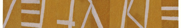
"For the Fifth Wall," detail
In hindsight, I like to think that he recognized that I intuited a need for some sort of structure on which to build my composition. I wasn’t just placing shapes here and there willy nilly. So that’s a positive sign that I was on the right track. This need for an underlying structure has always been present in my work–intuitively. I’ve felt the need for it. On a rational level, it justifies what goes on in the piece…from the zigzag lines whose elbows stick out beyond the borders of a piece (“Blackberry Winter”)

"Blackberry Winter I," ©1985, 73" x 37," tufted wool pile/ cotton backing/ acid dyes
to the scalloped edges that define and contain the energy channeled through chutes of directional pattern and color (“Constrictor Constrictor”).

"Constrictor Constrictor," © 1984, 74" x 96," tufted wool pile/ cotton backing/ acid dyes
The jutting-out-elbows and the scallop edges aren’t imposed on the composition. In fact, I recall that before conceiving the design for “Constrictor Constrictor,” I knew that I wanted to use scallop edges. They seemed so textilian so I found a way to incorporate them into the structure. I devised a way to justify them. They became the structure, actually, as the energy flowing in their direction “rounds the bend” of the scallop and is contained and redirected into the piece and goes hurdling toward the opposite edge. My 4th rug and first with irregular edges.
I’d found form!
ikat dyeing, color, spatial illusion
February 25, 2012
NOTE: Skip if not interested in the procedural aspects of dyeing wool…though scroll down and see the embedded photographs of my work.
This entry somewhat overlaps an earlier post on ikat dyeing (aka space dyeing), but is more specific as to the preparation of the yarn and additions of color to the dye baths.
In an earlier entry on ikat dyeing (aka space dyeing), I showed photographs of pieces in which dots and dashes of color or natural white added visual texture. These white dots are the original color of the yarn before I dyed it. To have sections of the skein of wool yarn resist absorption of the dye, I tightly wrap and tie random (or regular) sections of the (washed/rinsed/preferably dried) skein with plastic tape made specifically for this use. Particularly if I want only white dots, I’ll wind/tie one wrap of bean string. I space the tied sections evenly or haphazardly depending on the effect I want. Then I immerse the skeins into the prepared, hot dye bath. This dye bath contains the proportions of the different dye solutions that make up the dye formula I’m using to get color X.

"African Folds," detail, © 1990
To get colored rather than white dots or dashes on the dyed yarn, the procedure is basically the same except that I have dye the same skein in different dye baths–an extremely labor intensive and time consuming process. Say I want a medium blue yarn with lighter blue dots/dashes. First I need to prepare the dye formula for the medium blue I want, but I will be using only 50% of this dye solution in the first round of dyeing to get the lighter blue that will become the colored dots/dashes. I go through a whole dye session to get this 50% lighter blue. When the dye bath is clear, the first round of dyeing is done. I remove the skeins from the hot pots and let them cool until I can handle them. I then tightly tie sections of the yarn with plastic tape or bean string. The length of the tape-wrapped sections depends on whether I want long or short dashes of light blue. (Tufting produces loops as the needle goes through the backing. The amount of yarn that goes into each loop determines where the dots/dashes will appear on the tufted surface.)
I prepare a new dye bath with the remaining 50% of the dye formula for my medium blue. The wrapped sections will not absorb this dye and will remain light blue. I go through the whole dyeing process again and this time the unwrapped yarn absorbs the other half of the original dye solution for medium blue. When the dye bath is clear (all dye has been absorbed), I’m done except for rinsing the yarn, removing all the plastic ties, admiring the dashes of light blue against the darker blue, and hanging the wet yarn to dry.

"Amazonas," detail, © 1986
Say I want a blue yarn whose formula is made up of 30% red, 10% black B, 10% yellow, and 50% of alizarine blue. I can get a blue yarn with red dots or yellow dots although these hues will not be a saturated red nor yellow, but rather a pink and light yellow (because of the amount of red and yellow the formula calls for). For red/pink dots/dashes I’d have to initially dye the skein only with the 30% red part of the formula for blue. I go through the whole dye process till the dye bath is clear, take out the red/pink yarn, let it cool and start tying sections with plastic tape. These wrapped sections will remain pink through subsequent dyeing sessions. For the next dyeing session, I prepare the dye bath with the remaining colors that make up the blue formula. I immerse the tied pink yarn into the dye bath and go through the whole process till the dye bath is clear. I end up with a blue yarn with pink dots or dashes. Had I wanted yellow dots/dashes, I’d have substituted the 10% yellow dye for red in the first dye session
If I wanted a blue yarn with yellow and white dots/dashes, I’d tie the “virgin” yarn skein with plastic wrap to cover sections that I want to keep white. I then dye the yarn in the 10% yellow solution; get my yellow yarn dyed, and tie sections with tape that will resist the rest of the blue dye formula which goes into the next dye pot. I add the yarn to get it dyed blue. When done, I unwrap all the plastic ties and end up with my blue yarn with white and yellow dots/dashes.

"Jigsaw Puzzle," detail, © 1987
I find that ikat dyeing for colored dots/dashes works well with medium to dark colors. With lighter colors, I go for white dots/dashes because usually the % amounts of colored dots/dashes in the dye formula for color X are so light as to be not worth the trouble.

"Square Rug," detail, © 1984

"Square Rug," detail, © 1984

"Square Rug," detail, © 1984

"Square Rug," detail, © 1984
I practically ran amok in “Square Rug” in the density and variety of color and visual texture imparted on the piece via ikat dyeing. I get my dots and dashes to work in two ways here, both having to do with the illusion of space. When I use ikat dyed yarn to fill an area or shape, that area of color is pushed into the background giving the impression of great depth, of infinite space. When I tuft a gestural line of ikated yarn and have it cut across shapes and ground, it pops to the foreground and pushes the shapes it traverses into an indefinite middle ground. Neat-o.
I don’t do ikat dyeing any more for large pieces…it’s just too laborious and my work has evolved beyond what its effects add to my artwork. Over the years I have simplified my colors and my compositions so much so that ikated yarns would detract from what I’m now after (in 2012). In fact, I’ve gone so far as to remove color from my work–other than black and white–as in the pieced white organdy constructions sewn onto black plexiglas and the black 3D rubber constructions I make. Also, my tufted wool compositions became simpler (which does not translate into less complex) as I pared down my palette to one or two colors. I made ikated yarns and mottled colors integral to my compositions at the time (mid-’80s/early ’90s). They contributed mightily to the chaos and gestural aspects of my work and in defining illusionist space. By now, as my work has evolved and in certain ways simplified, my visual vocabulary has changed. It’s a big relief not to have to spend hours in a high humidity and smelly dye lab (from the glacial acidic acid used in dyeing with acid dyes). I did enjoy dyeing at the time, but wouldn’t do it today. I just don’t have the stamina or strength to repeatedly lift water-sopped or hot dye-bath sopped, weighty, industrial skeins of wool yarn in and out of wash and rinse buckets or dye pots. When a commission comes along, I go into my notebooks with color yarn samples to find the colors I want and hire a professional dye facility that specializes in small batch dye projects.


