ikat dyeing, color, spatial illusion
February 25, 2012
NOTE: Skip if not interested in the procedural aspects of dyeing wool…though scroll down and see the embedded photographs of my work.
This entry somewhat overlaps an earlier post on ikat dyeing (aka space dyeing), but is more specific as to the preparation of the yarn and additions of color to the dye baths.
In an earlier entry on ikat dyeing (aka space dyeing), I showed photographs of pieces in which dots and dashes of color or natural white added visual texture. These white dots are the original color of the yarn before I dyed it. To have sections of the skein of wool yarn resist absorption of the dye, I tightly wrap and tie random (or regular) sections of the (washed/rinsed/preferably dried) skein with plastic tape made specifically for this use. Particularly if I want only white dots, I’ll wind/tie one wrap of bean string. I space the tied sections evenly or haphazardly depending on the effect I want. Then I immerse the skeins into the prepared, hot dye bath. This dye bath contains the proportions of the different dye solutions that make up the dye formula I’m using to get color X.

"African Folds," detail, © 1990
To get colored rather than white dots or dashes on the dyed yarn, the procedure is basically the same except that I have dye the same skein in different dye baths–an extremely labor intensive and time consuming process. Say I want a medium blue yarn with lighter blue dots/dashes. First I need to prepare the dye formula for the medium blue I want, but I will be using only 50% of this dye solution in the first round of dyeing to get the lighter blue that will become the colored dots/dashes. I go through a whole dye session to get this 50% lighter blue. When the dye bath is clear, the first round of dyeing is done. I remove the skeins from the hot pots and let them cool until I can handle them. I then tightly tie sections of the yarn with plastic tape or bean string. The length of the tape-wrapped sections depends on whether I want long or short dashes of light blue. (Tufting produces loops as the needle goes through the backing. The amount of yarn that goes into each loop determines where the dots/dashes will appear on the tufted surface.)
I prepare a new dye bath with the remaining 50% of the dye formula for my medium blue. The wrapped sections will not absorb this dye and will remain light blue. I go through the whole dyeing process again and this time the unwrapped yarn absorbs the other half of the original dye solution for medium blue. When the dye bath is clear (all dye has been absorbed), I’m done except for rinsing the yarn, removing all the plastic ties, admiring the dashes of light blue against the darker blue, and hanging the wet yarn to dry.

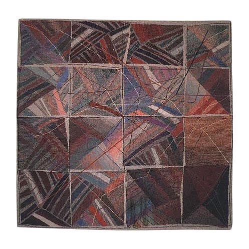
"Amazonas," detail, © 1986
Say I want a blue yarn whose formula is made up of 30% red, 10% black B, 10% yellow, and 50% of alizarine blue. I can get a blue yarn with red dots or yellow dots although these hues will not be a saturated red nor yellow, but rather a pink and light yellow (because of the amount of red and yellow the formula calls for). For red/pink dots/dashes I’d have to initially dye the skein only with the 30% red part of the formula for blue. I go through the whole dye process till the dye bath is clear, take out the red/pink yarn, let it cool and start tying sections with plastic tape. These wrapped sections will remain pink through subsequent dyeing sessions. For the next dyeing session, I prepare the dye bath with the remaining colors that make up the blue formula. I immerse the tied pink yarn into the dye bath and go through the whole process till the dye bath is clear. I end up with a blue yarn with pink dots or dashes. Had I wanted yellow dots/dashes, I’d have substituted the 10% yellow dye for red in the first dye session
If I wanted a blue yarn with yellow and white dots/dashes, I’d tie the “virgin” yarn skein with plastic wrap to cover sections that I want to keep white. I then dye the yarn in the 10% yellow solution; get my yellow yarn dyed, and tie sections with tape that will resist the rest of the blue dye formula which goes into the next dye pot. I add the yarn to get it dyed blue. When done, I unwrap all the plastic ties and end up with my blue yarn with white and yellow dots/dashes.

"Jigsaw Puzzle," detail, © 1987
I find that ikat dyeing for colored dots/dashes works well with medium to dark colors. With lighter colors, I go for white dots/dashes because usually the % amounts of colored dots/dashes in the dye formula for color X are so light as to be not worth the trouble.

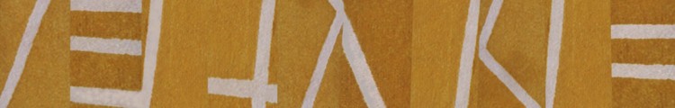
"Square Rug," detail, © 1984

"Square Rug," detail, © 1984

"Square Rug," detail, © 1984

"Square Rug," detail, © 1984
I practically ran amok in “Square Rug” in the density and variety of color and visual texture imparted on the piece via ikat dyeing. I get my dots and dashes to work in two ways here, both having to do with the illusion of space. When I use ikat dyed yarn to fill an area or shape, that area of color is pushed into the background giving the impression of great depth, of infinite space. When I tuft a gestural line of ikated yarn and have it cut across shapes and ground, it pops to the foreground and pushes the shapes it traverses into an indefinite middle ground. Neat-o.
I don’t do ikat dyeing any more for large pieces…it’s just too laborious and my work has evolved beyond what its effects add to my artwork. Over the years I have simplified my colors and my compositions so much so that ikated yarns would detract from what I’m now after (in 2012). In fact, I’ve gone so far as to remove color from my work–other than black and white–as in the pieced white organdy constructions sewn onto black plexiglas and the black 3D rubber constructions I make. Also, my tufted wool compositions became simpler (which does not translate into less complex) as I pared down my palette to one or two colors. I made ikated yarns and mottled colors integral to my compositions at the time (mid-’80s/early ’90s). They contributed mightily to the chaos and gestural aspects of my work and in defining illusionist space. By now, as my work has evolved and in certain ways simplified, my visual vocabulary has changed. It’s a big relief not to have to spend hours in a high humidity and smelly dye lab (from the glacial acidic acid used in dyeing with acid dyes). I did enjoy dyeing at the time, but wouldn’t do it today. I just don’t have the stamina or strength to repeatedly lift water-sopped or hot dye-bath sopped, weighty, industrial skeins of wool yarn in and out of wash and rinse buckets or dye pots. When a commission comes along, I go into my notebooks with color yarn samples to find the colors I want and hire a professional dye facility that specializes in small batch dye projects.
Abstract Fiber: line / pattern / structure / disorder
August 19, 2008
In this post I will give you a broad overview of how my work has evolved. I begin with what my work is about and then show you examples of representative pieces.
I make large-scale tufted wool wall pieces and, on a more intimate scale, pieced organdy constructions sewn onto acrylic. My approach is intuitive and spontaneous producing compositions with the gestural line of drawings and the measure and control of geometry. Yet the pieces remain true to the special qualities of the materials.
In my work, I offer a structure that is formal and spare, stressing silhouette, shape, surface, and line. I translate felt tensions into visual tensions. I feel a strong drive for order and yet I immediately rebel against it, embracing disorder-which one can also call spontaneity, lyricism, freedom. Lines begin and disappear; patterns swirl and dissolve; an ordered structure is often subverted by the movement of the fluid background. I see these tensions as a reflection of a central conflict in real life. What life feels like is the narrative my work relates in abstract compositions. Neither order nor chaos wins; the fun lies in the completely natural encounter between the two.
I completed this piece right out of graduate school. (It is now in the collection of the Indianapolis Museum of Art.)
Chromatic Fugue ©1986
My approach then was more painterly than what I do now. Current work is more linear and monochromatic as in Blue Matter, a recent commission (Wachovia Bank headquarters, Charlotte, NC):

Blue Matter ©2008
In the monochromatic tufted pieces, you still do get zapped with an area of intense color which holds its own against the swirl of hatched patterning. And not just any color…but yellow! which I recall being told had to be used sparingly. It’s interesting that in the order/ disorder struggle, in these pieces fluid, energetic lines are actually stripes of alternating white and deep blue. You can’t get more orderly and controlled than by the repetition of parallel lines which become patterned channels of energy.
I’d never thought in terms of having a painterly or linear approach. I picked up on this difference among artists from reading some time ago that Picasso had a gift for line. Since then I’ve taken notice that other artists lean more in one direction than in the other (duh!). I love line. My emphasis on line comes at the expense of color for I pared it way down to monochromatic, especially in my stitched organdy constructions. Perhaps this leap from tufting on a large scale to piecing relatively small pieces came about as color dropped away and line ascended. Line plays a different role in the pieced work. It’s more architectural, as artspeak would put it.
Since 2003, I’ve needed a more portable process for making art for our lives now involved more travel which meant being away from my studio (though I continue to make large tufted pieces). I began working on a more intimate scale piecing white cotton organdy and sewing it onto black plexiglass . My love of line comes through in the stitched and folded seams which become structural, like scaffolding. The contrasting translucency of the adjacent shapes reveals the lines. The layering of shapes provides more opacity and more rhythmic contrasts. This work has evolved from an initial series of buttons + machine top-stitched organdy compositions, to pieced and layered formal constructs, to the more recent exploding silhouettes. Their intimate size and monochromatic palette of whites makes for quiet, meditative works–like whispers.

Construction #13 ©2003
In my next post, I will write about how I, a late bloomer, got started making art.


